
A Framework For Evaluating Pitching Change Decision Making in Major League Baseball
- Sean
- Sep 22, 2024
- 29 min read
Updated: Sep 23, 2024
Criticizing the decision making of Major League Baseball (MLB) managers is a long time tradition of fans and is one of my favorite pastimes. Whether it is complaining about the lineup card, disagreeing with the decision to remove a starting pitcher, or pining for a pinch hitter during a high leverage situation, managers cannot escape us second guessing their every move. Of the types of decisions that get critiqued, pitching changes are amongst the highest profile decisions and occur the most frequently, so it is no surprise that they often get criticized the most. It’s not difficult to think back to several recent examples: John Schneider deciding to remove Jose Berrios in the second game between the Toronto Blue Jays and the Minnesota Twins in the 2023 playoffs, Brandon Pfaadt getting removed by Torrey Lovullo during the third game of the 2023 National League Championship series between the Arizona Diamondbacks and Philadelphia Phillies, and perhaps most famously, Blake Snell being removed by Kevin Cash during Game 6 of the 2020 World Series between the Tampa Bay Rays and Los Angeles Dodgers.
Online discourse after these moves can often be brutal, but that comes with the territory of professional sports. My issue with much of what I see online - and often with my own initial reaction - is that we focus too much on the outcome instead of considering the decision-making process. Was the manager thinking about the next batter’s recent hot streak or the fact that they haven’t touched the starting pitcher all game? Did the pitcher chosen to replace the starting pitcher match up better versus the next three batters in the lineup? It seems fair to believe that all managers are thinking about these and many more questions when making the decision to make a pitching change.
What I sought out to do was create a framework that evaluates team’s “processes” when it comes to pitching change decisions. I wanted to do this not only because I believed that it would be a good technical challenge for me, but also because I thought that it would be fun to have some numbers in my back pocket that would support my argument for why I surprisingly agreed with a move made by Pedro Grifol (yes, I wrote this before he was fired) or disagreed with a move made by Craig Counsel. Additionally, I wanted to share it all with anyone who would be interested in having a resource to affirm or challenge their own opinions on pitching change decisions made by managers.
While it is imperfect, I believe this project to be a sound attempt at quantifying something that is quite complicated and one that will provide fans additional insight into evaluating their favorite team’s pitching change decision making. I have to warn you that the rest of this post is very long - mostly because I want to be forthcoming about “how the sausage is made” so that you can form your own opinion on what I did. I encourage folks to read it, but certainly understand that you may skim and home in on the important parts. In the subsequent sections, I will be detailing my methodology, sharing results, and providing a guiding hand as to how you can use the output of this project to serve as proof that you were totally right to disagree with that boneheaded move your favorite team’s manager made.
A Survey Of Previous Work
Before we get into the nitty gritty, I think that it is important to discuss what has already been publicly shared on the general topic of evaluating pitching change decision making or even more broadly, bullpen management. As you can imagine, this is not a novel idea. I am not the first person to want to quantify the effect of pitching changes and bullpen management decisions. If you google it for yourself, you will come across a variety of blog posts, articles, and everything in between.
One of the first references that I dove into was a blog post by Jeremy Greenhouse, written in 2009, titled “Bullpen Management”. Greenhouse looked at aligning the Win Probability Added (WPA) of a given reliever with the average Leverage Index (LI) that they faced in relief appearances. Greenhouse’s reasoning behind this approach was to evaluate a manager’s ability to utilize their better relievers when it mattered most. The notion of evaluating decisions based on the in-game situation when the decision was made was something that I used in my own approach. Tim Kniker took Greenhouse’s work a step further with his Bullpen Management Above Random (BMAR), where he incorporated a manager’s ability to exploit the lefty-righty matchup. Kniker used Weighted On Base Average (wOBA) and LI to generate BMAR. To help conceptualize BMAR, Kniker stated that “Essentially, a BMAR of 15 says that by putting the best pitchers in the highest leverage situations, the Effective wOBA of the opponent’s hitter is 15 points worse than if the manager chose his relievers at random”. The idea of considering the handedness matchups is a good thing to do - so it was something that I also used in my own project.
Circling back to Greenhouse’s approach, he wasn’t the only one to use WPA and LI. Dan Lependorf used these two metrics to create his metric, Manager WPA, but used them differently than Greenhouse to evaluate bullpen decision making. “...WPA gives a total picture of a player’s contributions to a team’s win. Subtracting context-independent WPA/LI leaves behind only the effects from the timing of game events…all that remains is how a manager helped or hurt his team with his bullpen management decisions”. Lependorf’s research found that managers who use their bullpens efficiently added between two and three wins to a team’s season win total whereas managers who did so inefficiently cost their teams one to two games in a season. I wanted to specifically mention this because it is important to address the “so what” component of any project - especially one where you’re trying to get folks to buy into your idea. My project didn’t venture into trying to quantify just how many wins or losses pitching change decisions affect, but I wanted to highlight that if we use Leppendorf’s methodology, we can see that fretting over pitching change decisions doesn’t really move the needle a whole lot one way or the other (with the obvious caveat that it matters to the teams that are fighting for playoff spots).
The last project that I want to highlight is Dani Treisman’s Manager Scorecards project. I wanted to highlight Treisman’s work primarily because our methodology shares a lot of similarities but also because we realized that we were both working on essentially the same idea and he was more than willing to collaborate, share ideas, and provide feedback throughout my journey to finally getting this out into the wild. It would be grossly negligent of myself to not acknowledge this, to not reference his work, and to not also point you to what he did! Moving along to the details, Treisman’s methodology focused on predicted expected runs for batter versus pitcher plate appearance matchups and also predicted expected runs for the same batter versus each available pitcher in the bullpen. The comparison of these predicted run values is what generated “expected runs lost”. He also incorporated predicting the likelihood of a pitching change and used that to weight the final metric, “xRuns Lost”. The idea of generating hypothetical plate appearance matchups and focusing on the plate appearance level was also a key component of my approach, so it was very beneficial to compare and contrast the granular details of our methodologies.
My Methodology
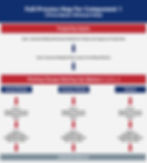
Now that you know my motivation and the previous work that I used as foundations for my approach, let’s actually talk about what I did. To properly evaluate the “process” behind a pitching change decision, I needed to put my MLB Manager’s thinking cap on and identify the considerations that I believed to be what managers (or teams) must account for when making a pitching change. The first consideration was that when a pitching change occurs, the manager must be confident that the pitcher they are choosing to insert would be expected to give up less runs than the pitcher they are replacing - given the batters they will face. The second consideration is that the pitcher being inserted into the game should be expected to perform better than the other pitchers available in the bullpen. The third consideration is the Three-Batter Minimum Rule - which requires pitchers inserted into a game to face a minimum of three batters in an appearance or pitch to the end of a half inning. The fourth and last consideration is the game state at the time of the pitching change (aka the Leverage Index). Each of these four considerations shaped how I evaluated pitching change decisions.

To use a real life example to help illustrate each of these considerations: on July 13, 2024, in the bottom of the 9th inning while up 5-4 over the Chicago Cubs, the St. Louis Cardinals replaced JoJo Romero with Ryan Helsley. When Oliver Marmol made this decision, he knew that Helsley would need to face Michael Bush, Seiya Suzuki, and Ian Happ in order to satisfy the Three-Batter Minimum Rule. I decided to refer to the plate appearances needed to satisfy the Three-Batter Minimum Rule as the “first component”. The first component looks at the decision through the lens of the Three-Batter Minimum rule and attempts to determine if the inserted pitcher was the best choice given who was previously pitching as well as the other options available at the time. The Three-Batter Minimum rule is considered because once a pitcher is inserted into a game, they are bound to satisfy the rule before being eligible for removal. Thus, the decision evaluation should include a focus on the matchups needed to satisfy the rule. To properly assess the first component, it was further broken down into two sub-components. The first sub-component evaluates the decision by comparing how the inserted pitcher (Helsley) would be expected to perform relative to the expected performance of the pitcher who was removed (Romero), when considering the plate appearance matchups that would satisfy the Three-Batter Minimum rule. To be clear, performance is referring to limiting the number of runs allowed in a relief appearance. The second sub-component is similar to the first sub-component, but instead of comparing the actual pitcher to the pitcher they are replacing, the actual pitcher is compared to the expected performance of the other relief pitchers available in the bullpen.

While it was unknown at the time of the pitching change, Helsley ended up facing an additional Cubs batter, Christopher Morel, after the Three-Batter Minimum Rule was satisfied. I decided to refer to each subsequent plate appearance matchup after the rule was satisfied as the “second component”. The second component extends the evaluation of the decision by looking at every plate appearance matchup, for a relief appearance, after the Three-Batter Minimum rule has been satisfied and seeks to determine if the pitcher chosen to enter the game was left in too long past the Three-Batter Minimum rule threshold. For this, only the actual pitcher chosen and the pitchers still available in the bullpen were included. I did not include the previous pitcher because I felt that once the Three-Batter Minimum rule was satisfied, the original parameters of the decision had shifted. The manager was no longer bound to using the newly inserted pitcher and could now go to a different player in their bullpen. Thus, I felt that the previous pitcher was not relevant to this portion of the evaluation. It’s also important to note that not every pitching change extended past the Three-Batter Minimum rule. If that was the case, this portion of the evaluation was not included for those specific pitching changes.

With this framework in hand, I needed data to actually make any of this work. Luckily, there is a wonderful python package, called Pybaseball, that allows you to query a variety of baseball data resources. In my case, I queried pitch by pitch data from the 2021-2024 MLB seasons. Additionally, I needed to know what pitchers were on a team’s roster on a given day. So, I created a web scraping program that scrapes the active roster of each MLB team from their respective ESPN roster pages. This data was needed in order to provide the information necessary to approach a solution that evaluates a pitching change decision based on all of the available relief pitchers at the time of a pitching change. My web scraping program has been running since September 2022, so the ability to evaluate pitching change decisions is dependent on having roster data and thus I am not generating outputs for anything before the 2023 season. I also want to note that my program failed from 8/4/23 - 8/13/23, so I do not have roster data for these dates.
Circling back to the components discussed earlier, to be able to evaluate pitching change decisions in the manner I laid out, I needed to manipulate the data to create additional hypothetical matchups for the “versus previous pitcher” and “versus the pitchers available in the bullpen” elements. I created copies of the plate appearance matchups for the actual pitching change, but one copy had the previous pitcher inserted in the actual pitcher’s place and several copies were made that had the pitchers available in the bullpen inserted in the actual pitcher’s place. With the matchups set, I then joined them with the plate appearance specific inputs needed for the evaluation mechanism.
To generate the inputs for the evaluation mechanism, I wanted to ensure that they were coming from a reasonable sample size and that they accounted for handedness splits. I also engineered it so that the inputs were a rolling window and accurate as of the day of the plate appearance matchup. Landing on the amount of plate appearances to use as the ceiling for the rolling window was something that I struggled with. My initial iterations were focused on using a larger sample size but the challenge there was that relief pitchers would need multiple seasons of matchups in order to provide the data needed to fill the window. The trade-off would be between recency and reliability. If I wanted to focus more on recent results, then a smaller window would make sense, but it would likely sacrifice the accuracy of the framework. During my initial iterations of the project, I understood that the framework would take a while to pick up on shifts in a player’s performance trend. This makes sense given that with a larger sample size for the rolling window, it would take time for a player’s improved or declined performance to have more influence. Someone like Hunter Gaddis wasn’t favored very often, in these early iterations (in 2024), due to their rolling window largely being made up of “okay-ish” performances from plate appearance matchups in the past.
I ultimately decided to use 100 plate appearances as the sample size for pitchers’ and batters’ rolling performance windows. This number is a bit arbitrary, but it feels like a fair threshold to use given that I want to lean more on the side of recency. In the future, I may explore other techniques like returning to a larger sample size for the performance windows but assigning more weight to recent results. If a given batter or pitcher did not have enough plate appearances or batters faced to reach the determined threshold, I utilized a weighted average by allocating their specific performance as a proportion of how close they were to meeting the threshold. For example, if a player was 80% of the way to meeting the threshold, then the weighted average would see the player’s data accounting for 80% of the result and the league average accounting for the remaining 20%.
With the historic performance data generated, I needed to determine a way to use it to generate an expected performance output of the plate appearance matchups that made up a pitching change - which earlier I vaguely referred to as the evaluation mechanism. I went through a few different iterations of how to predict how many runs would be scored during a relief appearance, but I ultimately landed on using an updated version of the baseball simulation program that I originally built for my White Sox lineup submission challenges. The program requires inputs for On Base Percentage (OBP), Strikeout %, Balls In Play Outs %, Single %, Double %, Triple %, Home Run %, Walk %, Flyball %, Groundball %, Line Drive %, and Popup % in order to properly work. The batted ball type percentages were only for batted ball out events. For a specific batter versus pitcher matchup, I had the batter’s inputs and the pitcher’s inputs prepared and I needed to boil it down to a single input for each of the variables mentioned earlier.

Similar to how I bounced back and forth on what evaluation mechanism I should use, I also went down a handful of paths for how to generate the likelihood of specific events for a given plate appearance matchup between a batter and a pitcher. The simulation program can be broken down into three steps. While it doesn’t account for every possible event in a baseball game, Step 1 focuses on the three primary outcomes of a plate appearance matchup - which is an “On Base Event”, a “Ball In Play Out Event”, or a Strikeout. Steps 2 and 3 are only activated if an On Base Event or if a Ball In Play Out Event are triggered. Step 2 determines what type of On Base Event occurred and Step 3 determines the type of Ball In Play Out Event occurred. More detail on the simulation program will be discussed soon, but this context was needed to help explain what I did to generate the final inputs that would be fed to the simulation program.
Knowing that there are more or less three sets of “outcome” groups, I experimented with a few different models before ultimately landing on using three separate calibrated, tuned XGBoost classification models to accomplish this goal. The first model, which I called a “High Level Plate Appearance Outcome Model” took the batter’s and pitcher’s rolling performance window against the respective handedness matchup as well as the number of times the players have faced each other in a game, and predicted an outcome from one of three classes (On Base Event, Ball In Play Out Event, and Strikeout). The second model, the “On Base Event Outcome Model”, did the same thing, but predicted the outcome from one of five classes (Single, Double, Triple, Home Run, Walk). The third model, the “Ball In Play Out Event Model”, used the same approach as the other models and predicted an outcome from one of four classes (Flyball, Groundball, Popup, and Line Drive).
I don’t want to go into too much detail regarding the modeling process since my desire for this post is to be more approachable for non-data science type folks. But, I still want to mention a few details to help give some insight for those who may be interested. Each of the models were trained and tested using data from the 2021 and 2022 seasons. The models had imbalanced classes - meaning that for example, there is not an equal amount of On Base Events, Ball In Play Out Events, or Strikeouts. I used “sample_weights” to help with this challenge. Because of the imbalance, I wasn’t so much focused on the “accuracy” of the models. Instead, I was more interested in evaluation metrics such as Precision, Recall, F1-Score, and AUC ROC. I also tuned each of the models and calibrated the models - which is necessary because the output of a XGBoost classifier is not probabilistic. So, the calibration allows for me to interpret and use the class probabilities as the likelihood of the class' occurrence.
To reiterate the role the models play in this project, for a given plate appearance matchup, I provided the models with a batter’s and a pitcher’s rolling window performance as well as a variable that indicates the number of times they are facing each other in the game, to generate predictions. I wasn’t necessarily interested in predicting whether the batter would hit a double or a batted ball line drive out would occur - of course this was important during the model development process. Instead, I wanted the likelihood of these events since this is what I needed for the simulation program. With this in mind, I ran each real and hypothetical plate appearance matchups from the 2023 and 2024 seasons through the models and used the calibrated probabilities of the various events as inputs for the simulation program.

With the inputs generated, the next step in the process was to simulate the plate appearance matchups. I ultimately decided to use a simulation program over something like a regression model, because I felt like a major caveat would be how to account for the game state for any subsequent plate appearance matchup. What I mean is, using the example from earlier with Ryan Helsley replacing JoJo Romero, how could I apply the game state of the second batter in the plate appearance sequence to Romero when that game state was directly impacted by the actual outcome of the first batter’s plate appearance (against Helsley)? It would not be fair for me to evaluate Romero’s performance against Suzuki if there was a man on second base (Busch) because of them doubling off of Helsely in real life and not because that first batter reached there as a result of a hypothetical outcome. Because I wanted to conduct the evaluation at a plate appearance level, I felt that the best way to account for this challenge was to simulate the plate appearance outcomes and pass the resulting game state to the next plate appearance in the set. Now, if I just wanted to focus on the batters faced in the two components (before and after the Three-Batter Minimum Rule was satisfied), then a machine learning approach could work.
The simulation program is a simple baseball game simulation program that I created several years ago but adapted for this project. It isn’t perfect and does not account for every possible scenario in a baseball game, but it does cover the majority of actions that take place as the result of a plate appearance matchup. The simulation occurs at the plate appearance level and uses the inputs mentioned earlier to determine outcomes of the plate appearances. The program also has built in baserunning dynamics that allow for already present base runners to advance extra bases on balls in play. The probabilities for the baserunning dynamics were determined from 2021-2023 data. Examples of the base running dynamics include runners advancing to third base from first base on a single and scoring from first on a double. The simulation program took the game state as of the beginning of the plate appearance matchup set and simulated the plate appearance matchups, until each of the matchups were completed or the inning ended, 10,000 times. The number of iterations was set at 10,000 to ensure a large enough sample was generated and the average runs scored over those iterations was used as the final output.


With the data and simulation program in hand, I split each element of the two main components into their own workflows. The first element of the first component only included the batters faced by the actual pitcher in the relief appearance that satisfied the Three-Batter Minimum rule. Each of the pitching changes had their plate appearance matchups simulated 10,000 times and the average number of runs scored was logged. The second element of the first component was the hypothetical matchup of the actual batters faced in the relief appearance against the pitcher who was removed. Like the first element mentioned, each of the hypothetical sets of matchups were simulated and the average number of runs scored were logged. The third element of the first component was the same as the second element, except the available pitchers in the bullpen were evaluated. Games that occurred on dates not available in the roster database were not included in this portion of the assessment. Similar to the other two elements, the sets of matchups were simulated and the average number of runs scored were logged.
The second component worked differently than the first component as this portion of the evaluation treated each subsequent plate appearance matchup as a “sub-decision” within the actual pitching change. As an example, if a pitcher faced three batters to satisfy the Three-Batter Minimum rule and subsequently faced a fourth and fifth batter, each of these plate appearance matchups would be treated as distinct sub-decisions within the main pitching change decision. Only the actual pitcher and the pitchers available in the bullpen were considered for evaluation. The first element of the second component accounted for the actual pitchers and the matchup sets were simulated and average runs scored logged. The second element of the second component accounted for the other pitchers available in the bullpen and the matchup sets were simulated and the average runs scored logged. Games that occurred on dates not available in the roster database were not included in this portion of the assessment.

At this point, all of the outputs have been generated and they can be used to evaluate the decisions made by managers! When I set out at the beginning of this project, I wanted to be able to evaluate decision making at the pitching change level but also at a higher, rolled up level. The decision level breakouts would provide the granular level of detail that I wanted while the higher level evaluation would allow for a more simple comparison of overall decision making differences between teams. The high level metric that I created is called Pitching Change Decision Making Score (PCDMS) and I will break down how it is calculated.
PCDMS is a composite score that provides context for just how much this project’s framework agrees or disagrees with managers’ decision making in regards to pitching changes. Each of the components discussed earlier play an important role in the calculation of PCDMS, as does Leverage Index. To make it simple to conceptualize, think of PCDMS as a “grade”. In school, your overall grade for a class would be made up of several categories (exams, projects, homework assignments, etc) that each had their own weights towards your grade. For each category, like exams, there would typically be several exams that helped determine your overall performance for the category. PCDMS is essentially the same idea.
For each component and sub-component, I am determining the “Agreement Rate” for every decision made at every Leverage Index value in which a pitching change occurred at (here's how I am generating Leverage Index values). An “agreement” takes place when the actual pitcher is expected to surrender fewer runs than the previous pitcher or the pitchers available in the bullpen. For the comparison against the pitchers available in the bullpen, the actual pitcher’s expected performance is compared to the median expected performance of the pitchers available in the bullpen. This is meant to simplify the comparison.
Agreement Rate is very simply the proportion of decisions where the framework agrees with the actual pitcher chosen versus the comparison (previous pitcher or pitchers available in the bullpen). I then multiply the Agreement Rate by the Leverage Index, which determines how many “points” are moving on to the next step. The idea here is to weigh decision making at higher Leverage Index values more than lower values (a 50% agreement rate at 5.0 LI would be 2.5 versus a 50% agreement rate at 2 LI would be 1). Then, this is weighed by the proportion of the decisions made, of the total, at that Leverage Index. More weight is given to the game state situations where the most decisions occurred. Lastly, the results are summed, divided by the league average value, and transformed to center at 100 so that any value above or below 100 is understood to be that percent above or below the league average performance.
With each of the sub-component grades, I weighed and combined them to create the final composite score, PCDMS. I decided to weigh the results from the first component (Three-Batter Minimum Rule) by 55% and the results from the second component (Post Three-Batter Minimum Rule) by 45%. These weights were chosen based on the percentage share of plate appearance matchups that each of the components accounted for - meaning that roughly 55% of relief pitcher plate appearance matchups were before the Three Batter Minimum rule was satisfied and 45% occurred after. Similar to the other components of the grade, the results were transformed to center at 100 so that any value above or below 100 is understood to be that percent above or below the league average performance. Doing this allows for PCDMS to be an easy to understand metric as you can quickly determine how much better or worse a given team performed in regards to the framework agreeing or disagreeing with their decision making.

Let's Talk Results
If you’ve made it past the ridiculously long Methodology section, you deserve a prize. Luckily for you, I think that you’ve now made it to the most fun part: the results. I ran the 2023 and 2024 regular season (through 9/8/24) through the framework to generate PCDMS results. Note that for the PCDMS score, I am only evaluating regular season data. I still process postseason data, but do not include it in the overall score. Before further evaluating the results, it is important to understand that a team’s performance is “relative”. The evaluation is based on the decision made, with the options available to the team, at the time of the pitching change. A team’s bullpen earned run average (ERA) does not totally indicate the overall quality of decision making, as managers work with who they have available for any given day (we will get more into this in a moment). This is how teams like the Pirates and Diamondbacks are viewed more favorably despite higher bullpen ERAs and teams like the Braves and Dodgers didn’t grade out as well despite having amongst the lowest bullpen ERAs through 9/8/24. Additionally, it is important to understand that the framework agreeing with teams’ decision making will bode well for them in PCDMS but also that agreement occurring at a solid clip at higher leverage situations and more decisions coming at higher leverage situations will only help their score.

While I believe that the true value of the project comes in evaluating the raw simulation outputs at a pitching change decision level, using PCDMS does help us quickly calibrate how teams’ decision making aligns with the framework’s assessment. According to PCDMS, Oliver Marmol and the St. Louis Cardinals were the best at making sound decisions when making a pitching change with a PCDMS of 121.8. Going piece by piece, the Cardinals had the highest score for the first sub-component of the first component, with a score of 125.8, meaning that when considering the pitcher chosen versus the pitcher they are replacing, for the batters needed to be faced to satisfy the Three-Batter Minimum Rule, the framework generally favored their decisions. In fact, this result means that their score is about 26% higher than league average. Their overall Agreement Rate of 68.5% is best amongst all MLB teams and when breaking it down by Leverage Index buckets, the Cardinals faired well in Very High leverage situations with the second best Agreement Rate of 77.6% and very strongly in High leverage situations with the fourth best Agreement Rate of 71.7%. It is worth mentioning that I grouped the Leverage Index values into buckets for analysis, but that the groupings don’t necessarily account for the distribution of decisions made within those buckets. For example, Team A could have a very similar proportion of their decisions made at Very High leverage situations compared to Team B, but see more of their decisions take place at higher points (6+) than Team B (3-4 range). Circling back to the Cardinals, they had the fourth highest proportion of decisions made in Very High leverage situations, so having a healthy agreement rate paired with many decisions being made in these situations had a strong impact on this score.
Moving along to the second sub-component of the first component, the Cardinals had a score of 112.7, which is good for sixth amongst MLB teams. This means that when considering the pitcher chosen versus the other pitchers available in the bullpen at the time of the pitching change, for the batters needed to be faced to satisfy the Three-Batter Minimum Rule, the framework favored their decision making over other teams’. Their overall Agreement Rate is 52.9%, which interestingly enough is good for twenty-fourth in MLB. What drove their score was their Agreement Rate in Very High leverage situations, which was the tenth highest at 74.1%, and in Medium leverage situations, which was ninth highest at 59.0%. Each of these accounted for the fourth and sixth highest proportions of decisions made at their leverage bucket breakout. Another factor that helped the Cardinals’ score is that while their Agreement Rate for Low Leverage situations was only 40.7%, which is good for twenty-sixth in the league, the proportion of their decisions made in these situations was only 40.1% and also ranked twenty-sixth in the league. Essentially, the combination of the framework agreeing with decisions in Very High and Medium leverage situations paired with not as many decisions taking place at Low leverage situations explains the Cardinals’ score for this portion of the evaluation.
Finishing up with the only sub-component of the second component, the Cardinals had a score of 125.0, which ranks second amongst MLB teams. This means that when considering the pitcher chosen versus the other pitchers available in the bullpen for every subsequent plate appearance matchup after the Three-Batter Minimum Rule was satisfied, the framework favored their decision making over other teams’. Their overall Agreement Rate is 46.3%, which ranks 11th in MLB. What drove their score was their decision making during Very High leverage situations. The Agreement Rate for these situations was 69.0% and accounted for 13.7% of their decisions made. Each of these ranked fifth in MLB. Similar to the previous section, the Cardinals also did not have many decisions take place in Low leverage situations. Only about 54% of their decisions took place in Low leverage situations, which ranked 24th. So, their very strong Agreement Rate in Very High leverage situations paired with many of their decisions taking place in these situations and not having many decisions take place in Low leverage situations help explains why the Cardinals graded out so well for this portion of the evaluation.

The next step to understanding PCDMS is to take a closer look at the players that are directly affecting the scores. As discussed, the Cardinals grade out quite well and it certainly helps when they have several high quality relief pitchers on their roster in 2024. Looking at the pitchers the Cardinals inserted into the game, from the versus Three-Batter Minimum Rule perspective, players like Andrew Kittredge, JoJo Romero, and Ryan Helsley fare quite well when considering their Agreement Rate versus the previous pitcher as well as versus the bullpen. Kittridge’s versus previous pitcher Agreement Rate is 70.3% and his versus pitchers available in the bullpen Agreement Rate is 54.7%. As simple as this sounds, it means that the framework agreed with 70% of the decisions to replace a given pitcher with Kittridge and about 55% of the time it agreed with inserting Kittridge instead of other pitchers available in the bullpen. Romero’s Agreement Rates were quite similar at 66.7% for each breakout. Helsley’s were quite a bit better at 88.1% and 100%. The 100% Agreement Rate should catch your attention, but it is important to understand the context behind it. Helsley is typically used later in games and in save situations. When he is being inserted, it is typical for other high quality relievers to have already pitched. Additionally, Helsely is a very good pitcher and has had much success during the last few seasons. So, these two reasons help explain why the framework has favored him over the other options in the bullpen this year. Looking at the data from this perspective provides a level of granularity that helps further explain the context of a given team’s PCDMS rating.
With any new metric, it is important to understand the relationships it has to conventional metrics. I decided that I wanted to compare PCDMS to Bullpen ERA and overall team Winning Percentage through 9/8/24. I chose these two metrics because I felt like they were simple representations of metrics used to evaluate a team’s success. My suspicion was that there would be some relationship and predictive power between the metrics being compared.

Comparing PCDMS and Bullpen ERA, the correlation coefficient was -0.34 and the r-squared value was 0.12. The correlation coefficient indicates a moderate, negative relationship between the two metrics. This could be interpreted as when one metric decreases, the other also tends to decrease. Putting this back into terms of the project, this is saying that generally speaking, teams with lower PCDMS values also tend to have lower Bullpen ERAs. The r-squared value is telling us that about 12% of the variance of one of the metrics can be explained by the variance of the other metric. This tells us that there is some predictive power, but not much. My goal was to create a framework that evaluates decision making relative to who else was available at the time of when the decision was made. So, I was expecting to not see a strong or very strong relationship with Bullpen ERA, but I did suspect that there would be some relationship given the evaluation framework is comparing players’ expected performance that is built from a rolling performance window. Basically, Bullpen ERA is baked into the process in a slightly less direct way than simply including ERA as a variable in the modeling process.

Repeating this exercise, but for PCDMS and Winning Percentage, the correlation coefficient is 0.31 and the r-squared value is 0.10. The correlation coefficient indicates a moderate, positive relationship between the two metrics. This could be interpreted as when one metric increases, the other also tends to increase. So, generally speaking, teams with higher PCDMS values tended to have higher Winning Percentages. The r-squared value is telling us that about 10% of the variance of one of the metrics can be explained by the variance of the other. Similar to above, this is indicating that there is some predictive power, but not much. I do want to flag that if we were to remove the Chicago White Sox, the correlation coefficient and r-squared values would decrease quite a bit. A team having literally one of the worst seasons in history is muddying the water a bit with this comparison (an outlier in the wild). Given how I set up the framework, I initially thought that the relationship between these two variables would be quite weak. So considering that the relationship is as described and that it would be weaker had the Sox not been as terrible, I feel that the PCDMS framework is properly evaluating teams’ decision making relative to the players they have available at the time of the decision.
Now that you understand PCDMS, the results through early September of 2024, and the metric’s relationship with other indicators of a team’s success, let’s get to what I think to be the best part of this project: pitching change decision level breakouts. If it was unclear, everything previously discussed is built from distinct pitching change decisions. So, for every pitching change during the 2023 and 2024 seasons (including postseason games), I have the output from the framework that tells us how a given decision grades out. For each pitching change decision, we can see the game situation, a list of who was available in the bullpen for that game, and the specific plate appearance breakouts with a decision label as well as a run difference percentile that helps provide context to just how different the expected performance of the comparison group was.

The point of sharing this is to provide you with a breakdown for any pitching change decision that you may be interested in. As I said in the introduction, I wanted to create a framework that would evaluate teams’ “process” and provide us with numbers to aid or negate any ensuing debates! To do this, I have created a dashboard that contains all of these breakouts as well as much more relevant and useful information. You can access the dashboard here or at the link below and I have also created a separate blog post that walks a user through how to use and interpret the dashboard. Please, check it out for yourself!
Before wrapping up the results section, I want to talk about caveats, limitations of the project, and everything in between. I think the most obvious limitation of this project is that it views pitching change decisions in a vacuum - there is no consideration of strategy. For example, using the Cardinals again, a pitching change decision made in the fifth inning will compare the actual pitcher chosen to Ryan Helsley. Is it fair to do this? On one hand, no, because we know that the Cardinals prefer to use Helsley in a save situations so how can we penalize them for not using him earlier in the game? But on the other hand, perhaps we shouldn’t mold the framework to teams’ strategies and preferences. This wrinkle is what influenced my decision to bake the versus the bullpen comparisons by taking the median expected performance of the group. Doing this softens the potential comparison difference in performance. Regardless, it is still a limitation of the project and all results should be viewed through a critical lens.
Another limitation to the project is that it is built off hypothetical matchups whose outcomes are determined by machine learning algorithms and a simulation program. Speaking to the hypothetical matchups, this is complicated because the actual batters faced by the pitcher in real life could be slightly different had the actual pitcher been someone different. Who's to say that a pinch hitter wouldn’t be used? It’s not just the team pitching that is seeking to take advantage of platoon splits. To the point mentioning the modeling approach, no model is perfect and some of my choices certainly sacrifice the reliability of the models that I am using. Despite that, I do feel that my methodology is “sound” enough for a fun, public project like this. This is the third iteration of the project and I’d be foolish to think that I won’t continue to tinker with the methodology to make it as strong as possible. Who knows, perhaps someone reading this has helpful suggestions! But more importantly, I have been working on this project over the course of the last two years - it was time to get this out in the wild.
I am sure that I am missing some other limitations or caveats that you may think of, but I want to finish up by clearly stressing that the results from this project should not be taken 100% at face value. As I’ve reviewed the results, I have found plenty of examples of where I disagree with the framework. My disagreement could stem from purely a strategic point of view, or I was forgetting specific differences in players’ rolling performance windows that may be driving the result, or perhaps I’m observing results that stem from the modeling approach being imperfect. I can almost guarantee that you will find decisions that you disagree with. When this happens, I want to encourage you to think through the lens of this framework before ultimately deciding if you agree or disagree.
Closing Thoughts
Thank you for making it all the way to the end of this post. I know that this was a beast of a read…and I appreciate your time. As I have mentioned in the post, this is something that I’ve been working on quite some time (since the summer of 2022). As I got further into the project, I would come to realize that I was overlooking something, or that I needed to tweak an approach, or that I wanted to explore another angle. I also just don’t have the same time and energy that I used to. Most of this project was completed during the work week between the hours of 6:30am and 7:30am before starting work. As you can imagine, not a ton of work can get knocked out in just an hour. But, I made it work because I had this idea stuck in my head and wanted to get it out into a tangible tool for people to use. I know that this isn’t a novel, industry altering project and that’s okay. It’s something that I care about and find interesting - which is a good enough reason for pursuit in my biased opinion. Passion projects are supposed to be fun, right?
So, with all of that said, you may notice that the results section only runs through 9/8/24 and it is clearly past that date. My promise to you all is that I will update everything periodically. I anticipate weekly updates during the regular season and more frequent updates once the playoffs begin. I also plan on writing about some of the interesting decisions that we observe and will be comparing full regular season results between the 2023 and 2024 seasons once this season is over.
I also want to note that any helpful, constructive criticism and feedback is appreciated. As I said above - I don’t have as much time as I used to for my passion projects, so I can’t promise that I will act on every suggestion. But, I am always learning and open to what other folks think.
Lastly, I want to thank my wife for all of her support in my pursuit of my passion projects. I appreciate your encouragement in my “bee-bop-booping” (working on a computer for those who don’t know what that means). I also want to broadly thank everyone who talked shop with me, allowed me to bounce ideas off of them, and provided feedback. I greatly and genuinely appreciate you. Y'all know who you are.
Thanks again and if you like this, please share it with others!